Shiny Apps and Dashboards
Selected and publicly available R Shiny applications and related dashboards used to support various projects and research initiatives.
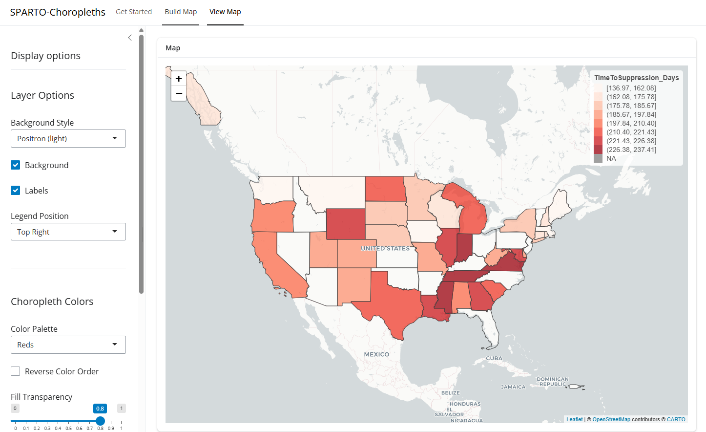
SPARTO-Choropleths — open-access dashboard for geographic visualization of HIV care continuum outcomes.
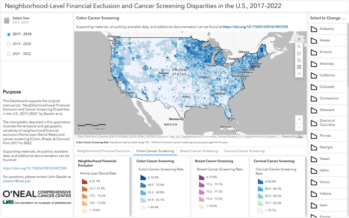
Neighborhood-Level Financial Exclusion and Cancer Screening Disparities in the U.S., 2017–2022 — web-based dashboard depicting choropleths illustrating the temporal and geographic variability of home loan denial rates and cancer screening rates (colorectal, breast, and cervical) by U.S. census tract.
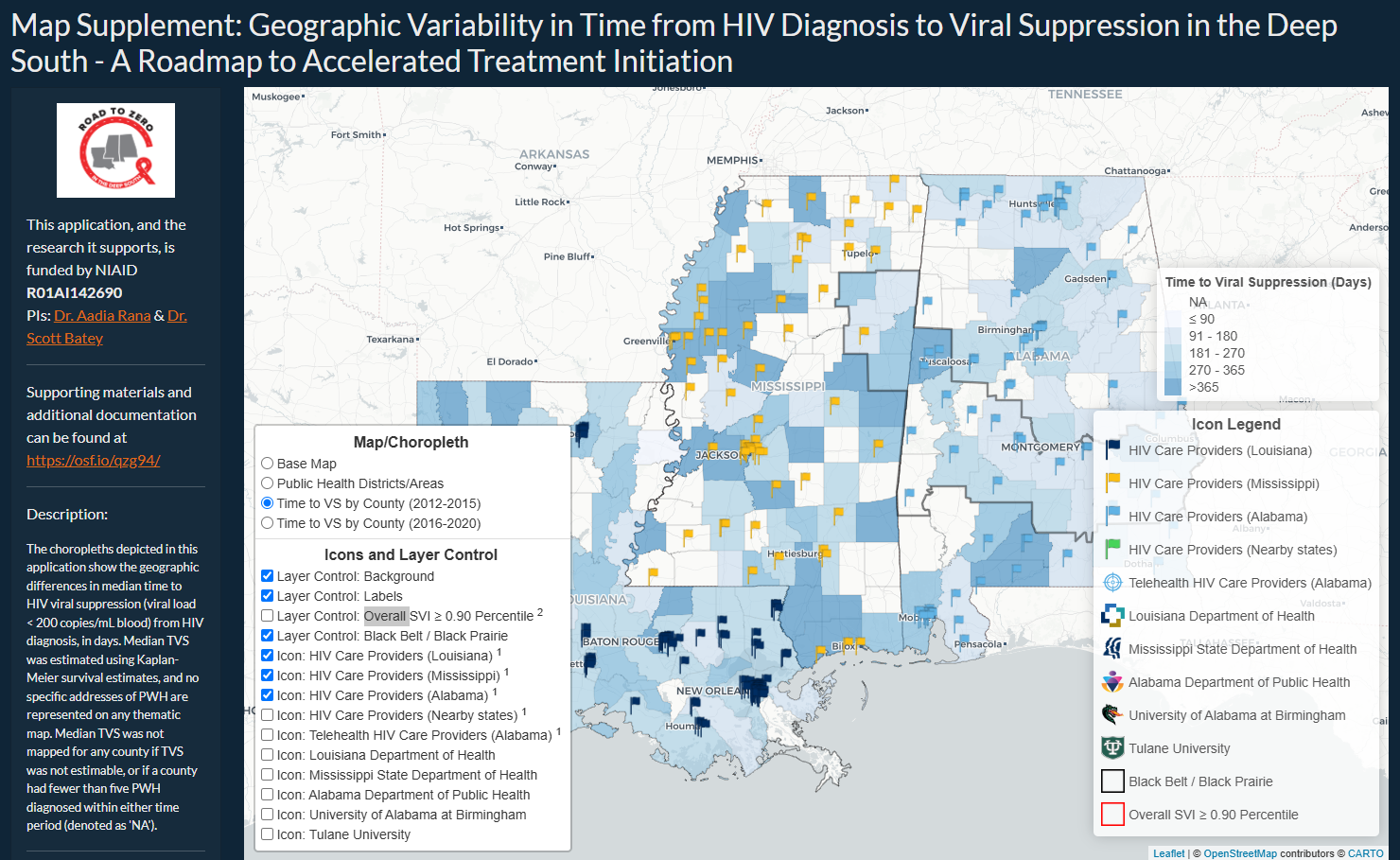
Geographic Variability in Time from HIV Diagnosis to Viral Suppression in the Deep South — map supplement to the geospatial analysis of HIV testing coverage across the Southeast.
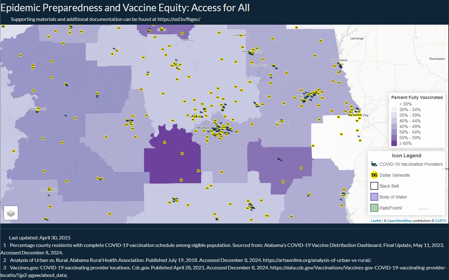
Epidemic Preparedness and Vaccine Equity: Access for All — map supplement exploring vaccine access and epidemic preparedness.
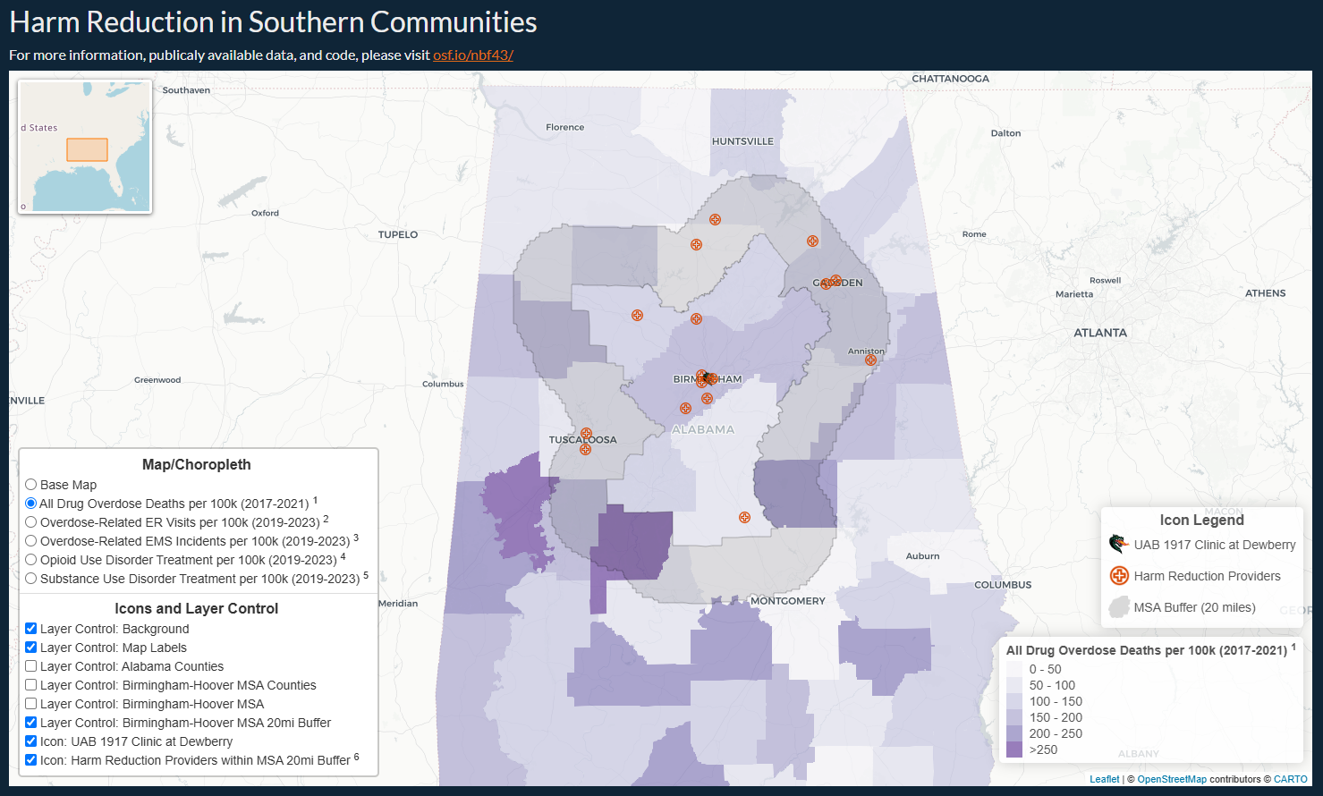
Comprehensive Harm Reduction and Medicine (CHRM) in Alabama — map supplement on harm reduction resource access in Alabama.
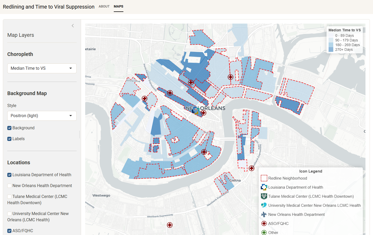
Redlining and Time to Viral Suppression Among Persons With HIV — map supplement to the JAMA Internal Medicine redlining study (see Publications and Press).